Merry New Year!
Those of you who’ve followed my career for a while may have noticed two things. One, that I’ve dabbled in damn near every medium to create my work. Two, that oil paint is almost never one of them. I’ve experimented with oils here and there, but have only ever completed one satisfactorily enough that I ever displayed it. Over time, I’ve become less satisfied, which is why you don’t see it in the main “Traditional” gallery on the site.
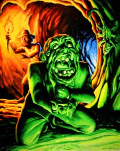
“I Wouldn’a Drunk That If I Was You” was done in September of 2007, when I was first looking to move beyond watercolor. This was also early on in me examining the effects of different colored lights illuminating a subject from different angles. At the time, I was a little too impatient to wait for oil paint to dry, which is why I soon switched back to acrylic, which had been my medium of choice in my teens. Over the next two years, I produced the series which includes “Babyface, Obviously” and “Queen of What?” Soon, I also became disenchanted with acrylics for drying TOO quickly and the way thinning water changes the value of the paint temporarily, sometimes resulting in some dark highlights. By then, had all but given up on paint entirely, save for the watercolors that I sometimes use to color my ink drawings.
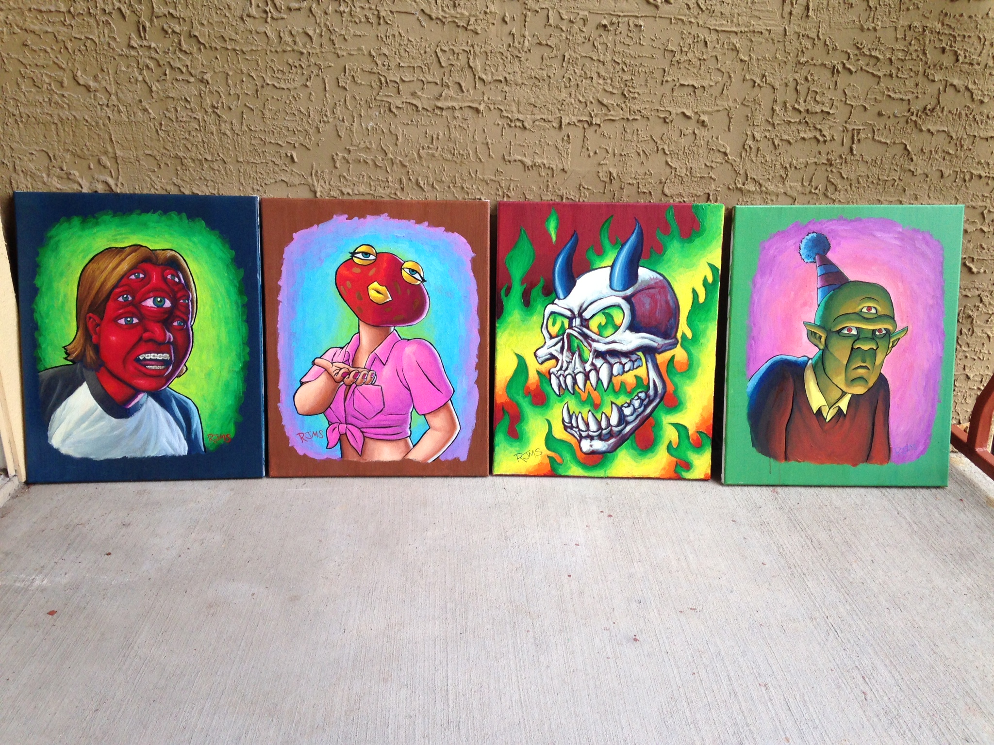
Fast forward to 2015. Having spent a few months meeting with the Doodle Crew every Saturday (Click the link for info.) and settling into a regimen of using Prismacolor Artstix on colored paper and checking out the gallery scene here in Austin, I rediscovered my passion for fine art and my desire to be a painter. For years, I had felt like I had some unfinished business with oils. If I could just develop my technique with them, I could get over my hangups and ineptitude and capture the look I was envisioning. As for the drying time, I could get around that by just starting several canvases and cycling through them, working on one while the others are drying, day by day. I got four 16″x20″ canvases and some tubes of oil paint to get me started, with the intention of redoing them in a much larger size later. Next, I had to select which doodles to adapt.
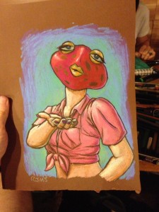
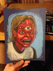
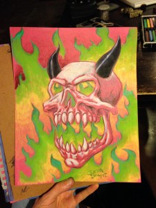
Since these were going to be relatively small and I’m not particularly skilled with oils, I decided to go with fairly simple ones which also feature different shades of light, though with much more subtlety. Meanwhile, I also took a stab at creating another one in Photoshop.
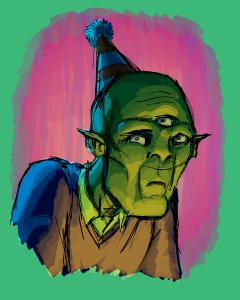
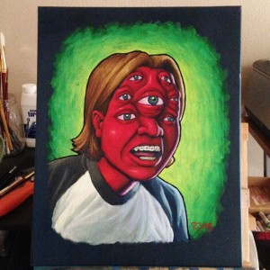
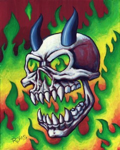
Since I had specifically whipped this one out for the project, I chose it as the first one to get translated into paint.
I should probably mention that the first step was actually applying several layers of several shades of green paint to create the streaky, nearly solid colored background. Since I wasn’t totally thrilled with the digital drawing, I made some changes when I sketched it onto the canvas. I had originally wanted this painting to have a rough, sketchy look like I would get with the Artstix, leaving some of the background green showing through. With my technique being as undeveloped as it is, I couldn’t help but to overwork it and overblend the colors until I wound up with some very smooth, slick gradients, which bothered me until I added the black outline.
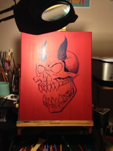
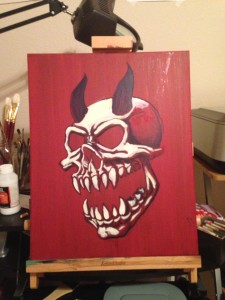
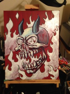
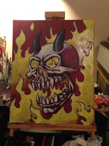
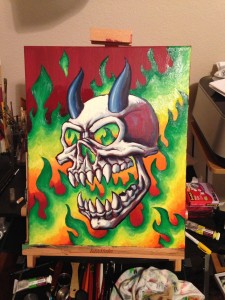
The second one started but first one finished was “When In Doubt, Skullz N’ Fire.” This wound up closest to what I had originally envisioned. One way that I kept things looking a little rough was adding some oil pastel into the mix. I’m definitely looking forward to repainting this on a much larger canvas in the near future, even making it part of a series called “The Skullfire Chronicles.”
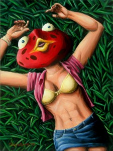
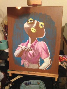
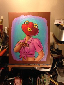
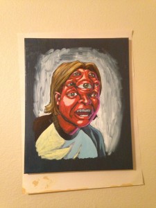
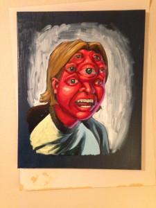
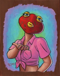
Some of you may remember “But’er Face.” If not, here she is.
Anyway, I felt she was due for a comeback, maybe with a little more confidence.
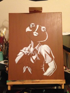
I wasn’t thrilled with how it was looking during those intermediate stages, which is why you don’t see more step-by-step photos. Again, I decided to go over the paint with some oil pastel to blend together some slick, inconsistently tinted brush strokes while giving it a rough look.
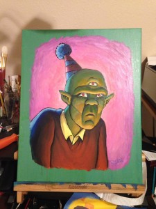
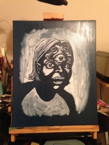
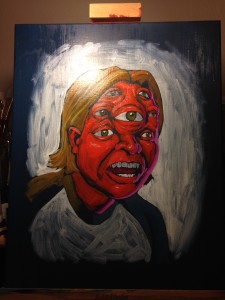
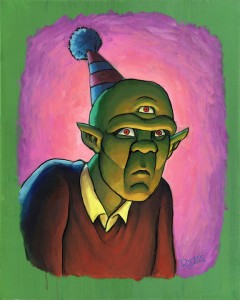
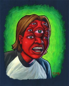
Another returning character is Septaclops, Jr.
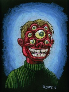
Back in 2002, I came up with a creature called Septaclops for a page of tattoo flashes. Unfortunately, I don’t have a scan of that available right now. However, eight years later, I decided to give him a son, seen here in his fifth grade portrait. Since then, Junior’s hit a rebellious phase and started smoking the funny stuff.
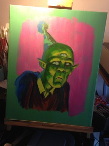
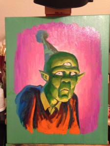
Much like the character himself, the painting was a bit of a problem child. Again, there are many intermediate stages that I just didn’t photograph because of how terrible this thing looked and how hard it was to even figure out what I was looking for, what color everything should be. I should have done more preparation, but then again, this whole thing was meant to be just practice anyway, so #%&$ it. Anyway, I was ready to throw this one in the dumpster before I decided to have at it with the oil pastels. One layer of oil pastel made it so much better that I decided not to add outlines to the inner details, only the one thick outline to separate him from the background.
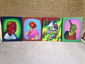
It took far longer than I’d expected, but I’m pretty pleased with how these turned out. These are definitely not the final versions of these, but I might still exhibit them. In the meantime, I’ll be working on the next set.
